Association Formation
A complete visual identity for a training association — an emblem built on the two universal symbols of learning, extend
- Client
- Comité Formation
- Our role
- Logo Design · Brand Identity · Motion Design
- Industry
- Association / Education
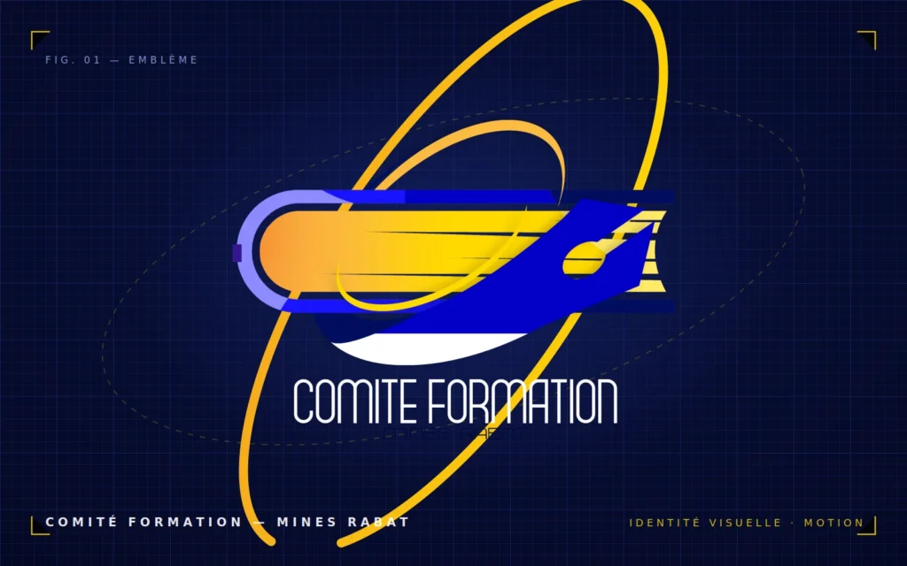
Comité Formation is an association dedicated to training and professional development at Mines Rabat. They needed a brand that felt credible and institutional, yet approachable — something members and partners would instantly associate with learning.
Arriving with no visual identity at all, the association needed everything at once: a logo that works as a small avatar and on a printed banner, a presence kit for social media, and a way to open and close their video content with a consistent branded signature.
The emblem is built on the two most universal symbols of education: an open book and a pen, composed into a badge-style mark that reads clearly at any size. Royal blue carries the institutional, trustworthy tone expected from a training body; gold highlights achievement — the reward at the end of learning.
-
01
Concept
Two universal symbols of education — an open book and a pen — composed into a single badge-style emblem that reads clearly at any size, from a social avatar to a printed banner.
-
02
Color system
Royal blue carries the institutional, trustworthy tone expected from a training body. Gold evokes achievement — the reward at the end of learning — and gives the mark its energy.
-
03
Variants
Light and dark presentation versions of the logo, so the identity holds on any background — documents, screens, dark video frames, or printed materials.
-
04
Motion design
An animated intro and outro produced in 4K — a branded opening and closing signature applied to all of the association's video content.
- Illustrator
- Photoshop
- After Effects
Have a project in mind?
Tell us what you're building and we'll come back within 24 hours.
Start a conversation